FinTech — SaaS
Yaydoo Vendorplace: 2× User Registrations
UX optimization for Yaydoo Vendorplace during product-market fit phase. More than doubled registered users and improved retention by 15%.
- Impact
- +15% retention
- Timeline
- Product in 4 months
Yaydoo Vendorplace is a product that was born in a Design Thinking session. Its objective was to complement the Yaydoo suite from a visualization for Directors and Managers. With a focus on strictly simple processes, we helped to grow a product almost from scratch.
A product with Product-Market-Fit
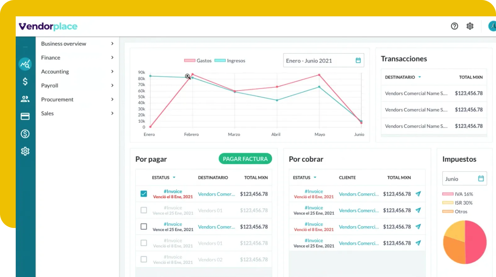
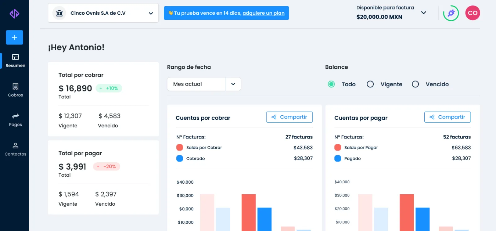
In combination with another product of the Yaydoo suite, Vendorplace offers Directors and Managers a quick and detailed view of their day-to-day business. After the company validated the product's MVP, the picture was bleak: good information but little adoption.
I want to grow as YaydooResults
- +40% weekly registrations.
- +200K USD transacted in the first quarter of its launching.
- +15% conversion rate from Freemium.
The team
- 6 developers
- 2 UX/UI designer
- 1 Product Designer by Comandos
- 1 Customer Experience
- 1 User Research
Understanding Yaydoo Vendorplace
Getting ready: Where are we? and What will we need?
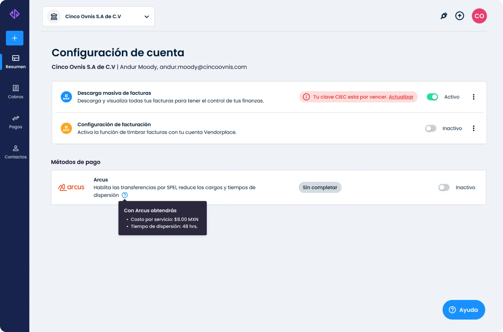
Yaydoo Vendorplace had two major problems: A brand uniformity with respect to the company to which it belonged and a usability not designed for mobile. Although the objective was to give visibility to high-level profiles, there was no proto-persona or previous user research, which hindered the adoption of the product. In a context where Yaydoo's workforce grew +140% in less than 7 months, we knew we had to act quickly to grow conversion, Vendorplace usability and product adoption.
Where to start?
With a complicated outlook and little time to reverse the results, we focused on 3 key opportunities:
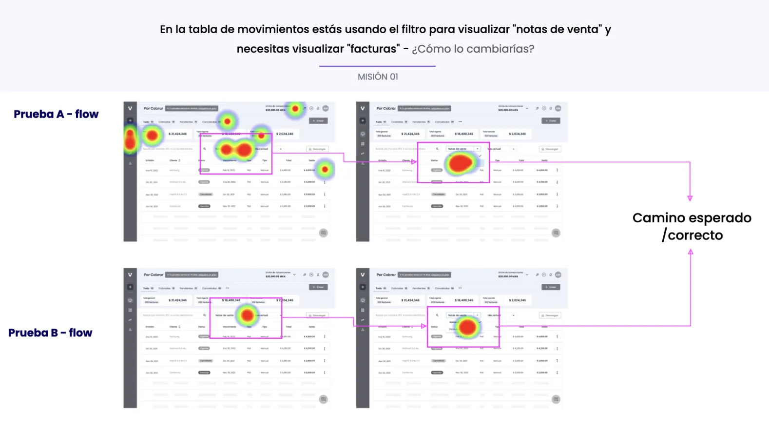
- Product Adoption: : When does the "Aha moment!" occur?
- Retention: : Registrations are important, but more important is how many of you stay using the product.
- Referral program: : Being at a very early stage, we aim at a referral program to enhance the quality network effect.
STEP 01
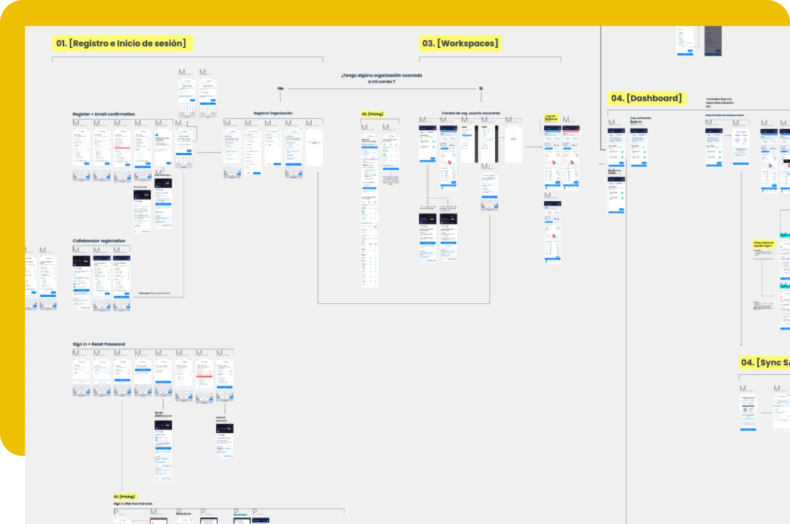
Define a proto-persona + User Journey
Focusing on a North Star Metric, we got down to work. We aligned with Product, Marketing and Customer Experience to define the obvious: what real problem are we solving? Who? Are we aware of the user journey + jobs-to-be-done?
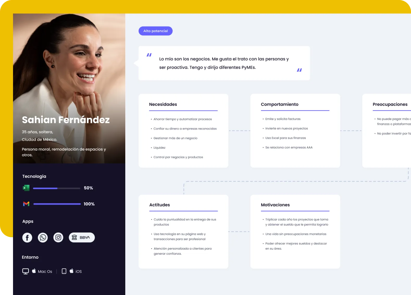
It didn't happen overnight, it took several weeks of user interviews to properly outline the proto-persona and fine tune the user journey. After a lot of coffee and experimentation, this was the result.
STEP 02
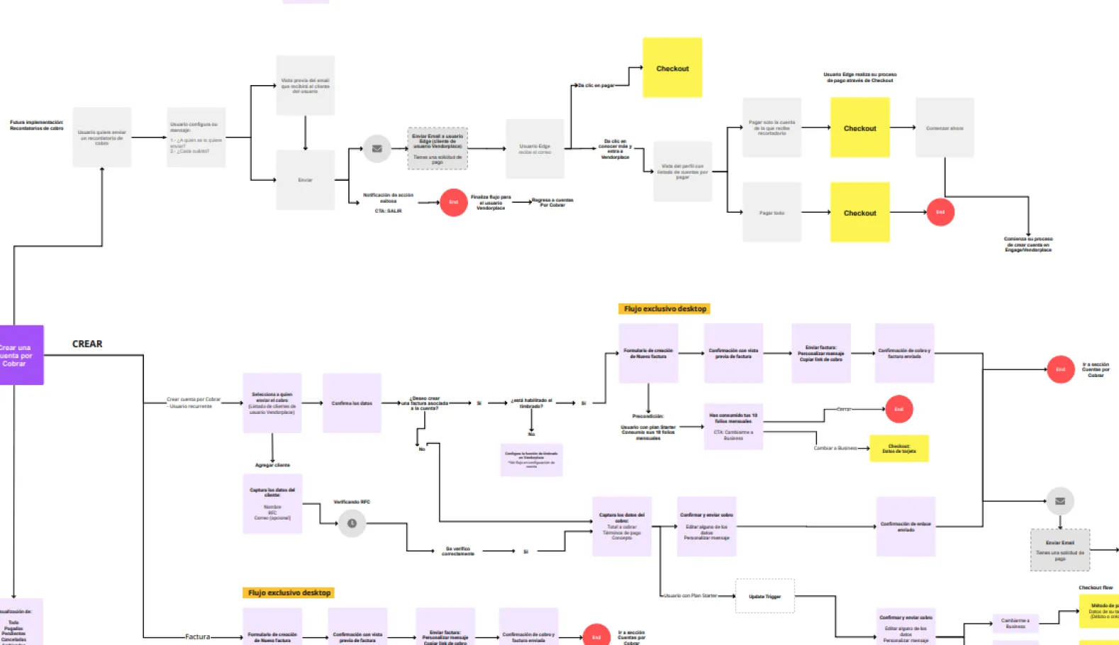
Experimentation and iteration
With a team trained to be resilient to failure, we started creating experiments and a lot of user research. Many of the experiments didn't turn out the way we wanted but we learned a lot, with a Design System in place and increasingly anti-fragile it made us truly Agile.
We celebrated with our users every progress, both for each job-to-be-done and for their level of transaction within Yaydoo Vendorplace. What backed it all up? Regular One-on-Ones and eyes on metrics.
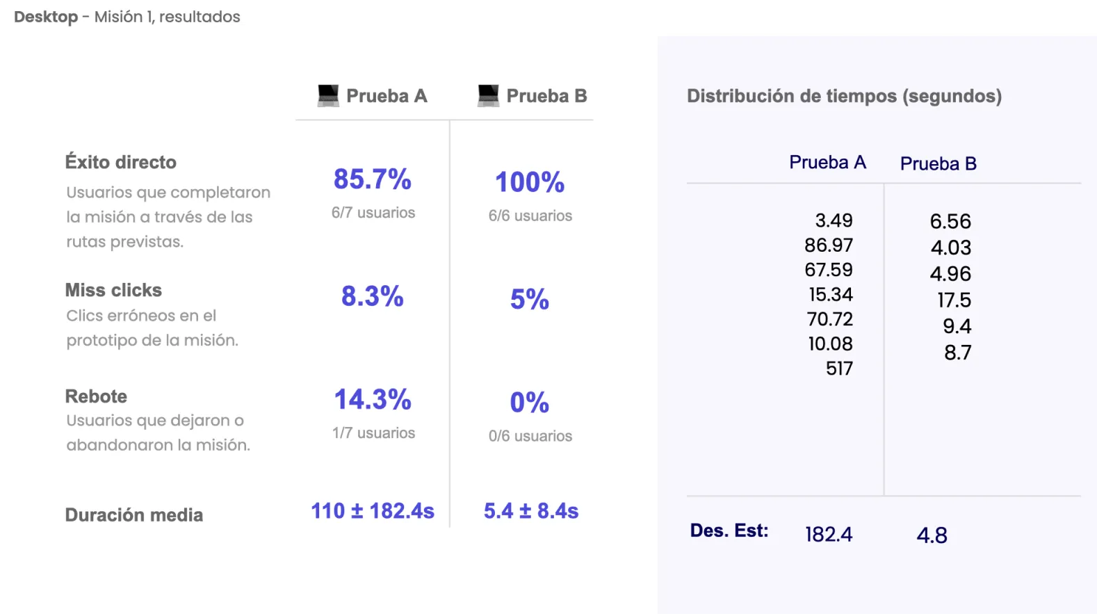
Metrics can mislead you if you don't know how to approach them or focus on vanity metrics. Some of our key metrics are measured by tasks we needed the user to do to discover the Aha moment in less than 30 days. Here is a random example from the extensive iteration process of this product.
A better than expected result
It took us about 6 months to build the product, after 20 iterations we achieved Product-Market-Fit. Although it took several weeks of iterations and experimentation, we were able to increase product adoption by 38% and retention after Freemium by 15%.
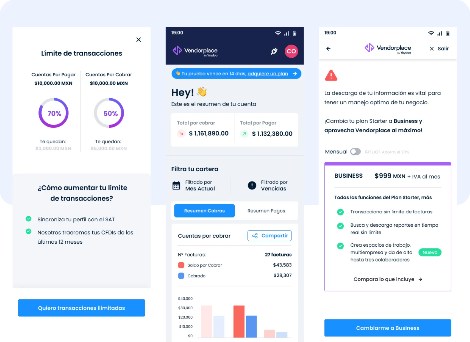
A product that doubled its user registrations
- 100% responsive Design Product
- Vendorplace shipped fully responsive from day one — desktop, tablet and mobile on the same Design System.
- +40% productivity
- Sustained +40% weekly registrations for 8 weeks after launch.
- 45% retention in free plan
- +15% conversion rate from Freemium and 45% retention on the free plan after the freemium window ended.
Keep exploring